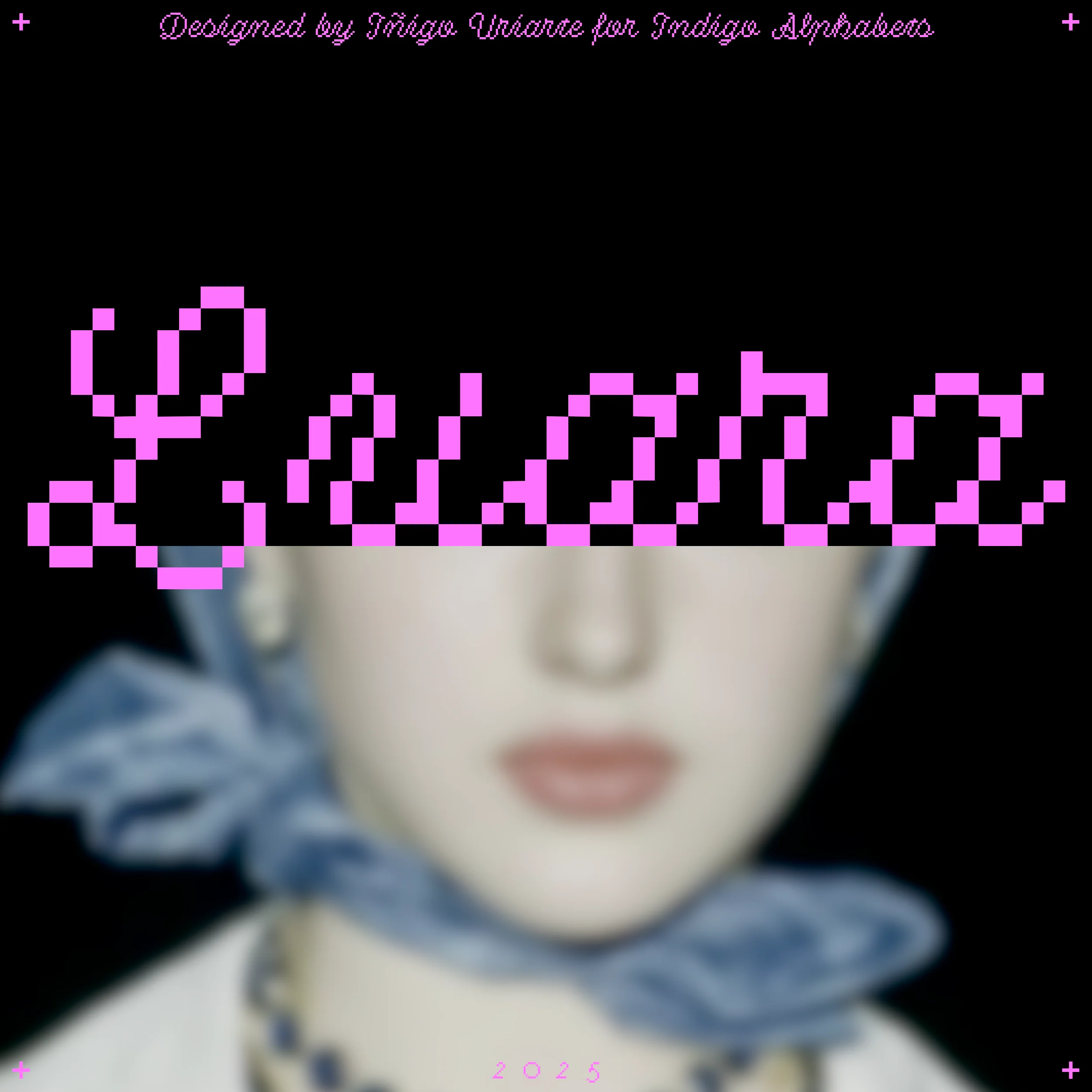
Non Sans
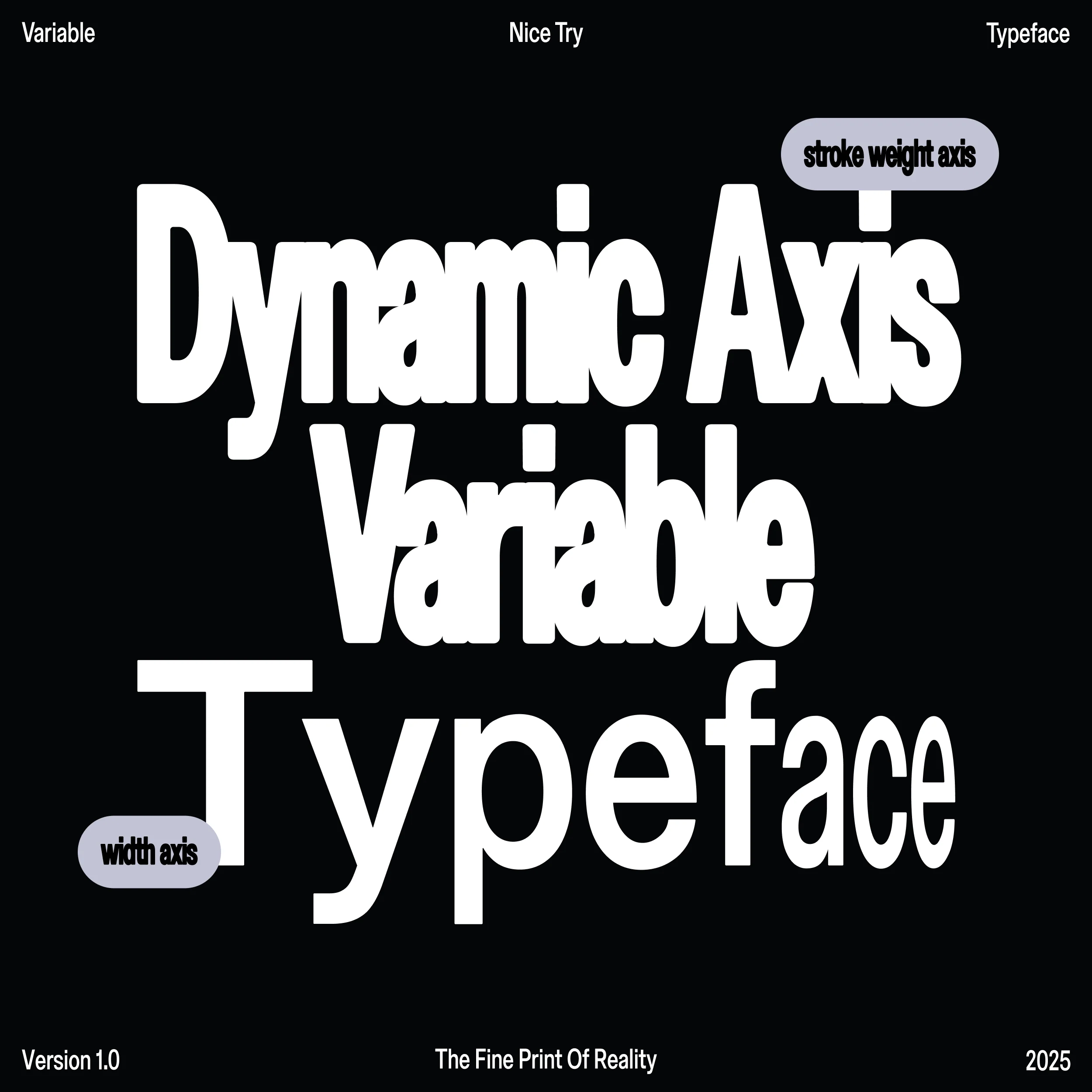
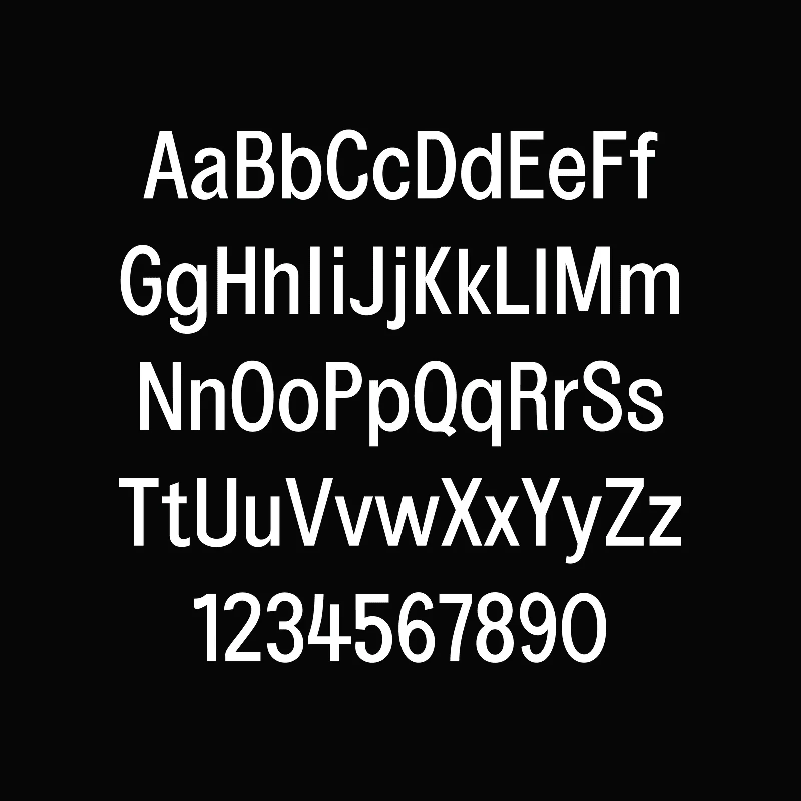
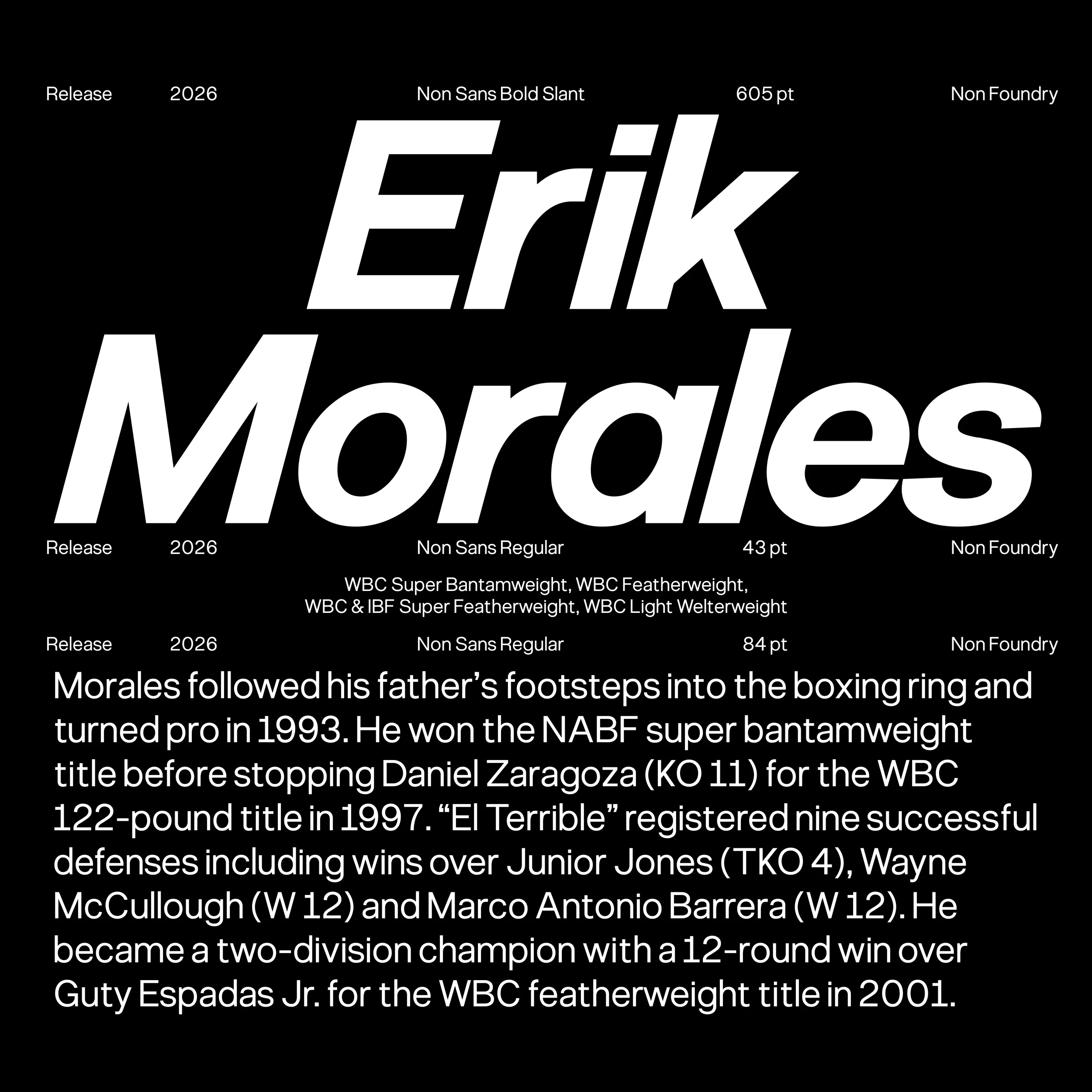
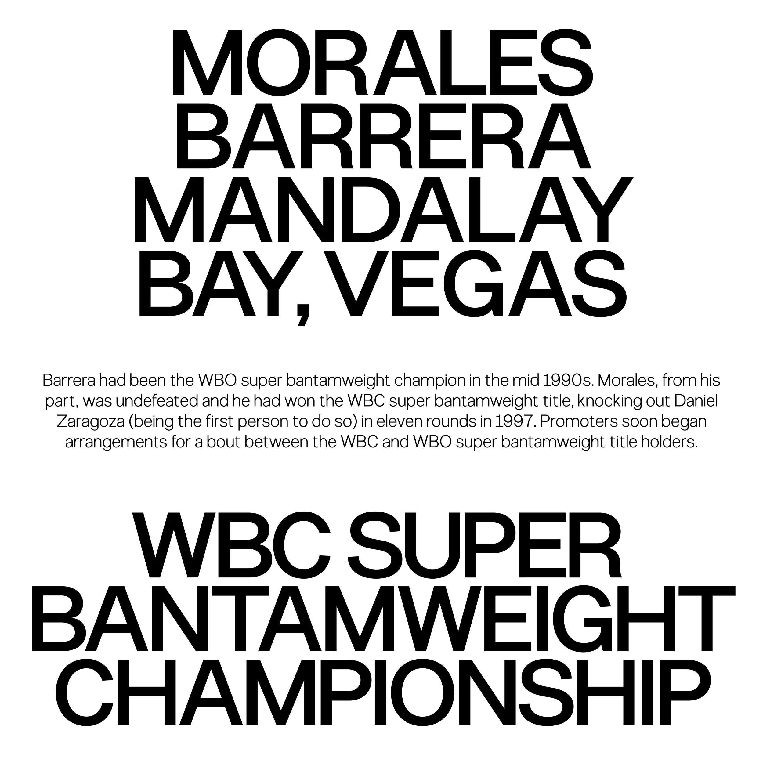
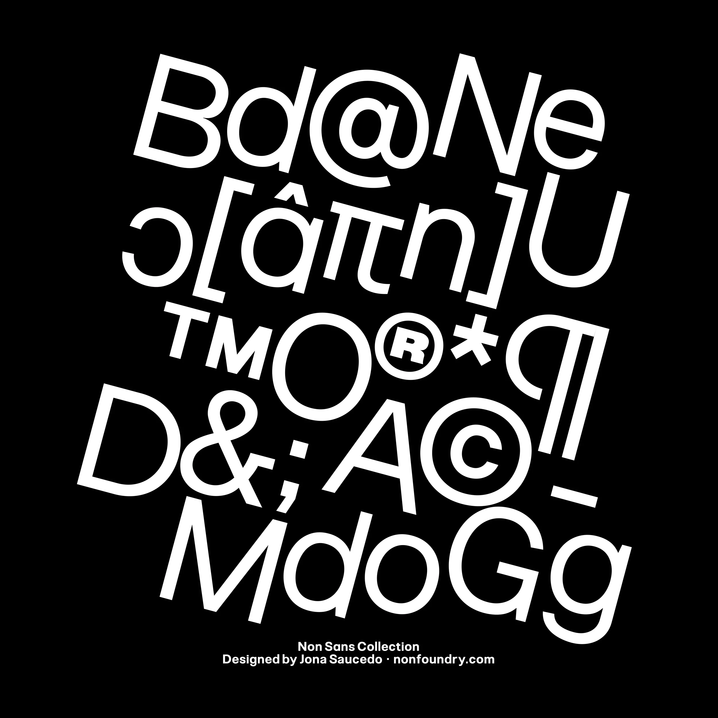
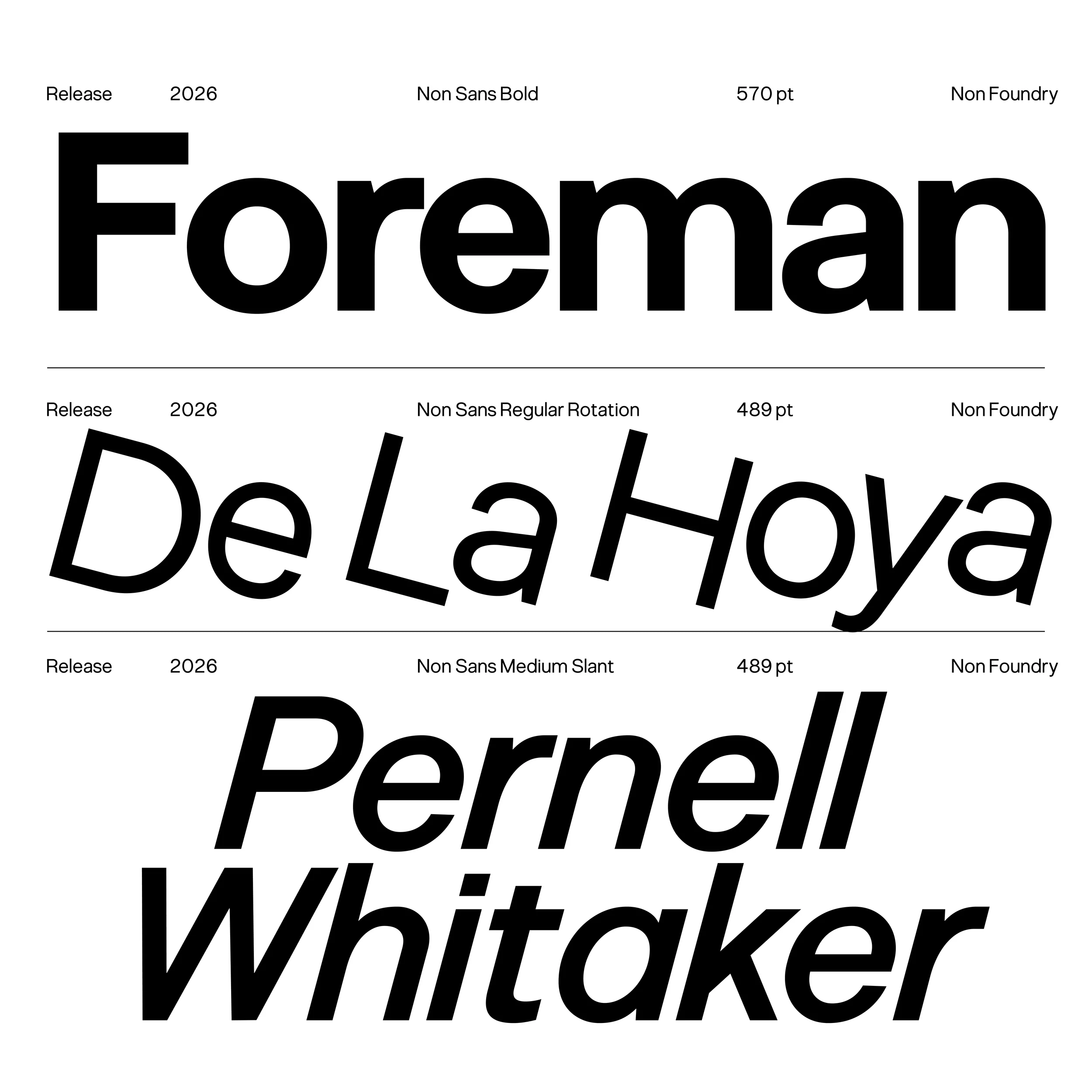
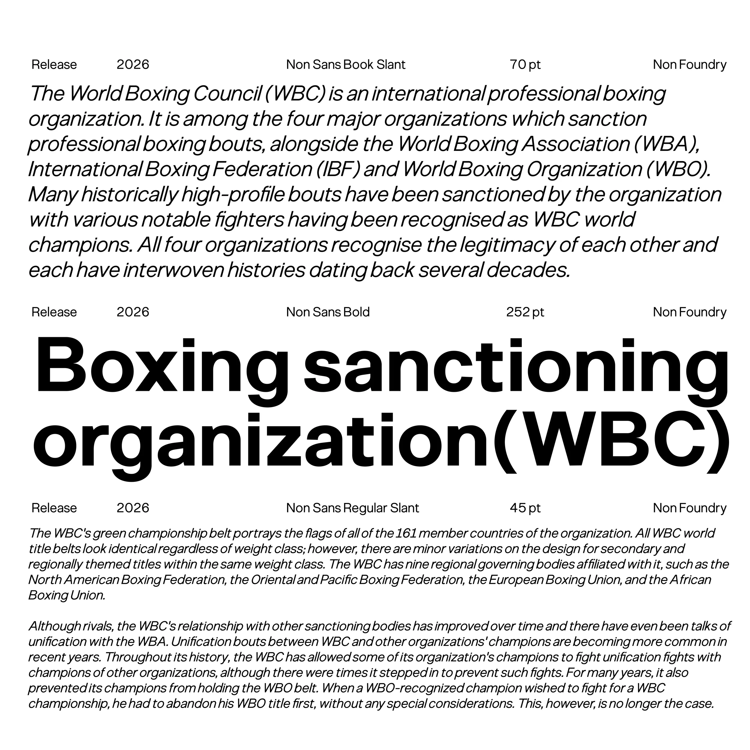
Non Sans is a grotesque style sans serif typeface defined by a dense, robust, and reliable visual construction. Its design creates a solid reading rhythm and a compact, well-balanced text block, making it ideal for typographic systems that demand presence, clarity, and consistency. From its earliest sketches, the influence of Swiss type design from the 1960s is evident, particularly in the functional treatment of forms and the modular structure of its characters.
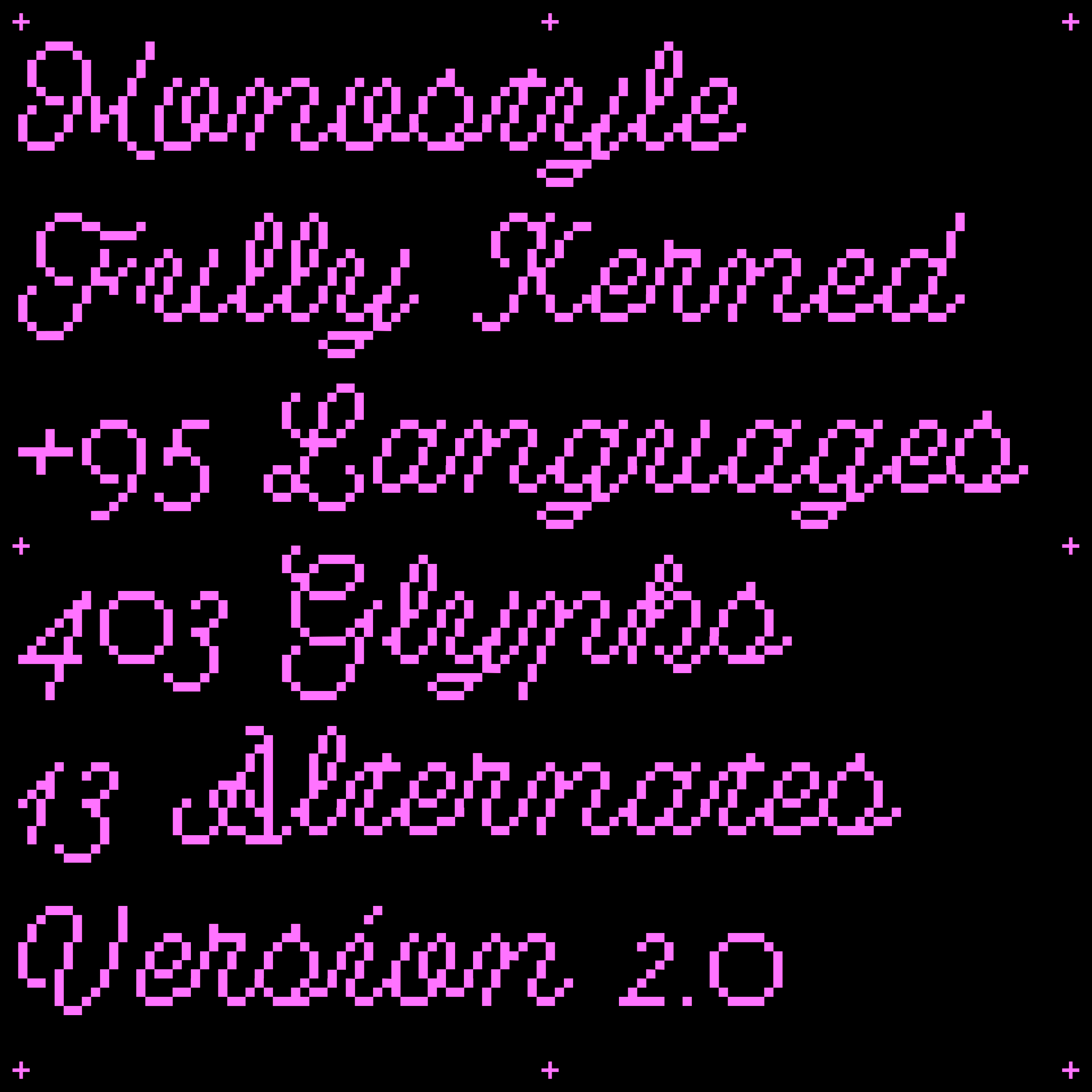
The family has been carefully refined to deliver strong typographic performance across a wide range of environments and formats. Non Sans features a unified system of x-heights, width proportions, and weight consistency, resulting in a precise and coherent typeface suitable for both editorial projects and digital or interface applications.
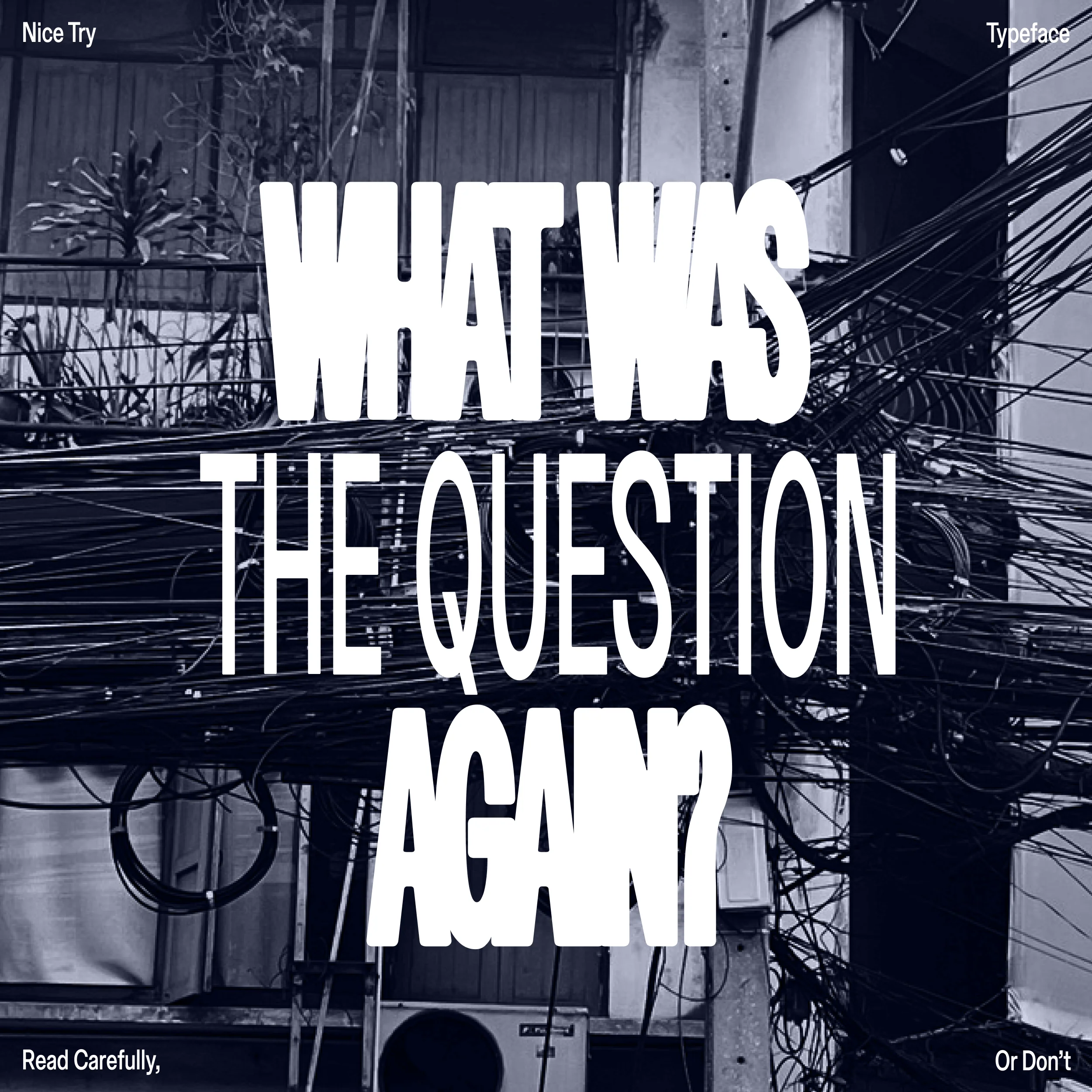
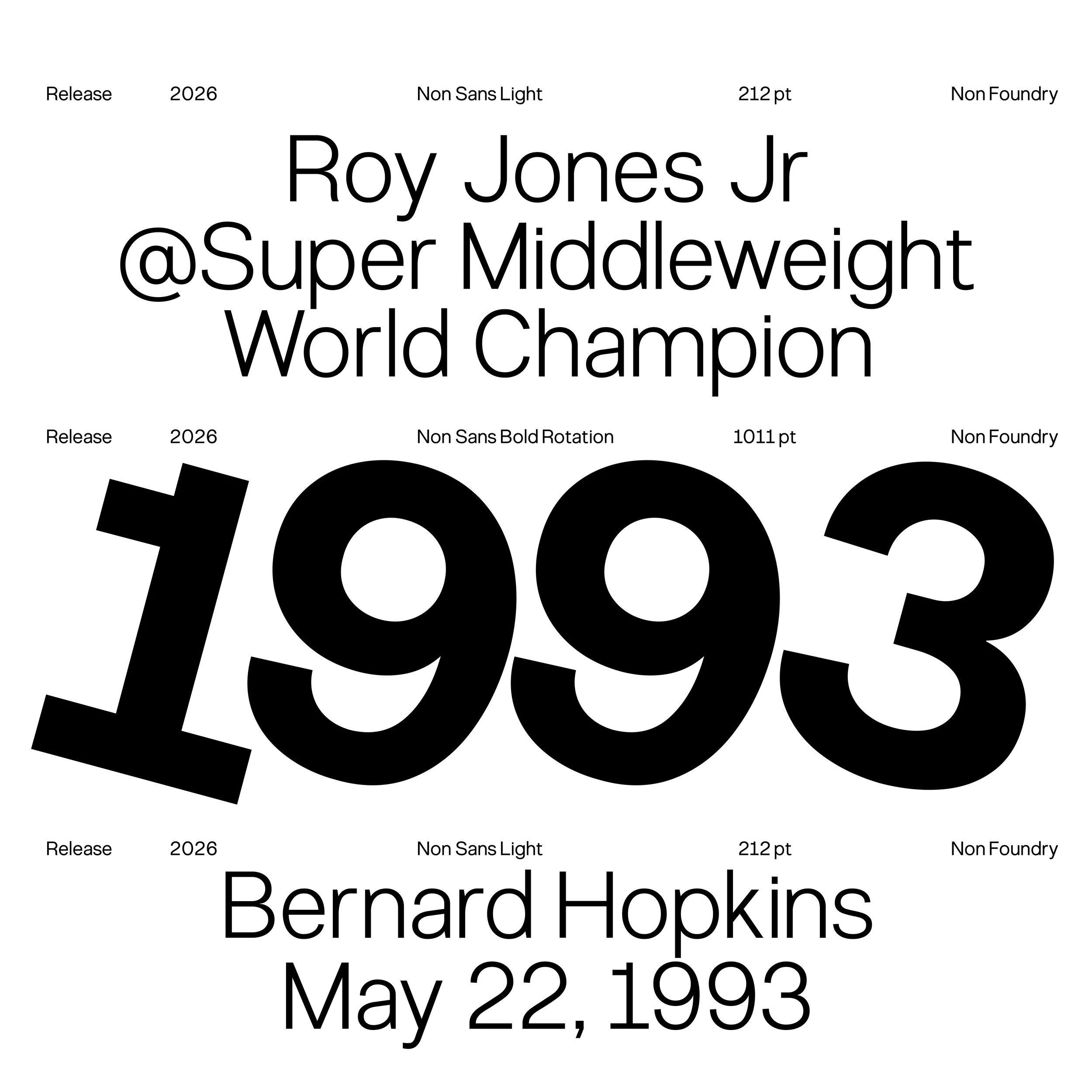
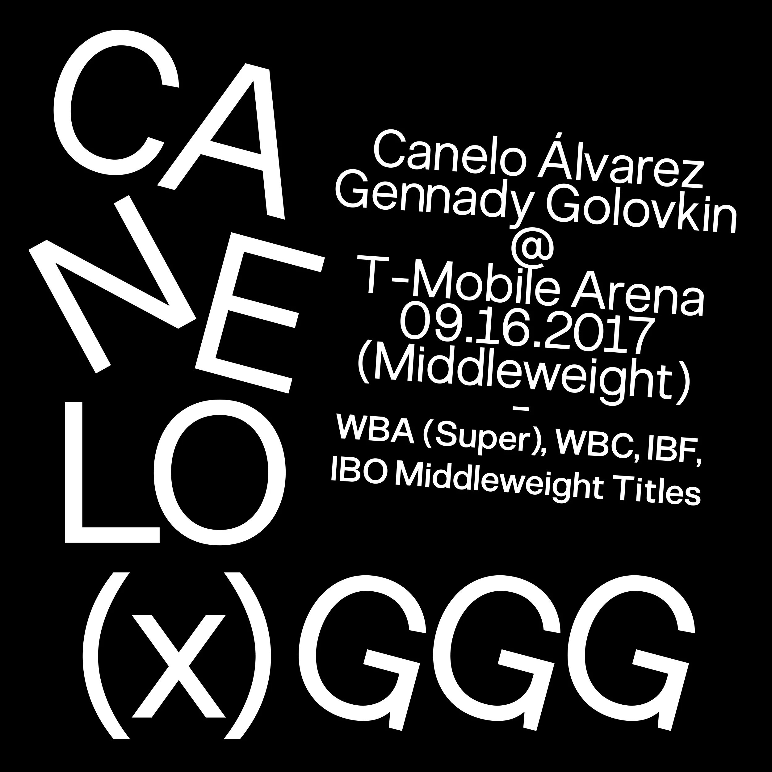
As part of the collection, Non Sans Slant preserves the strength of the base design while introducing dynamism and contrast, allowing for emphasis and hierarchy without breaking the system’s identity. In addition, the Rotate variant expands the expressive possibilities of the family. Designed for display use such as logos, posters, and graphic assets, this version retains the core structure and details of Non Sans while adding a distinctive and experimental character.
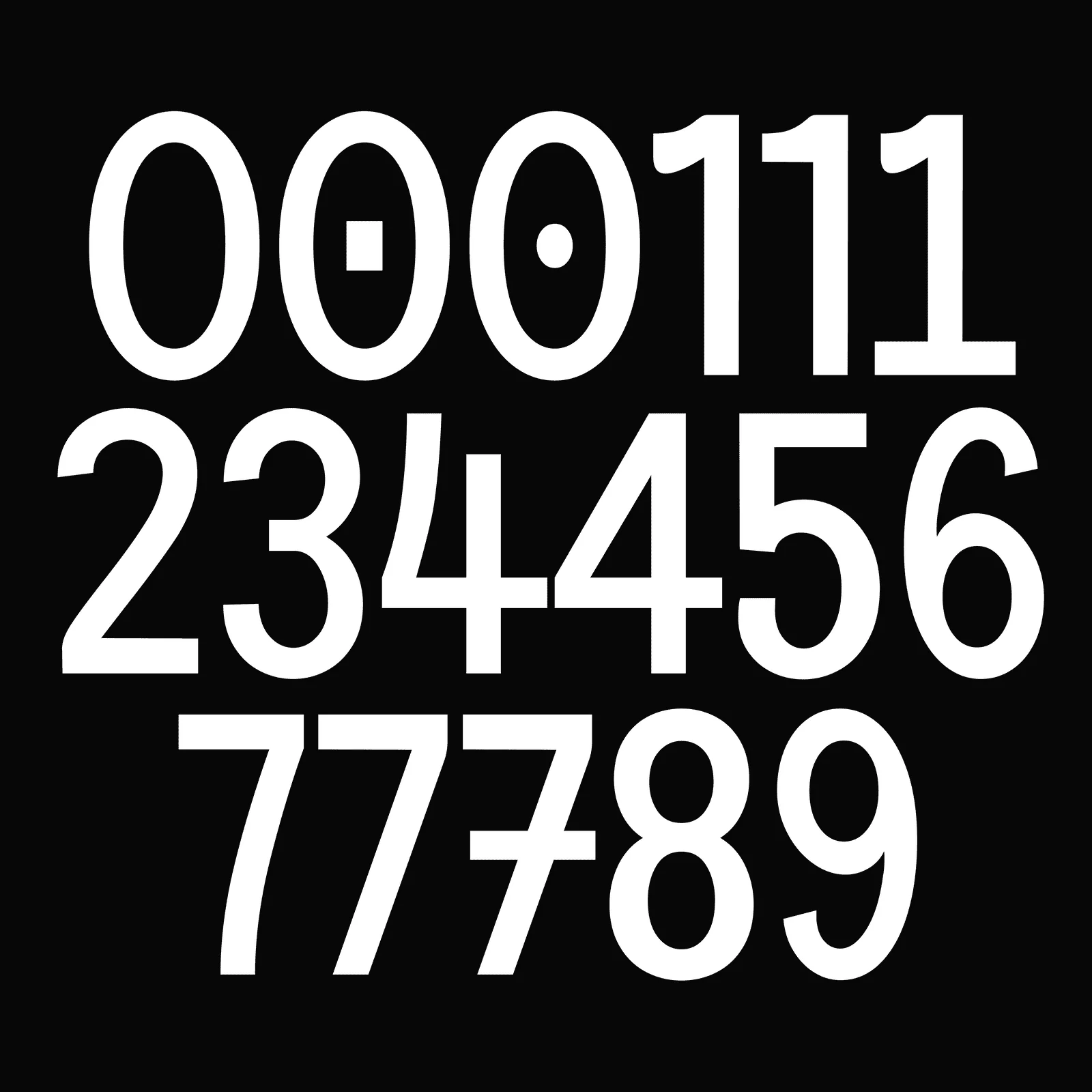
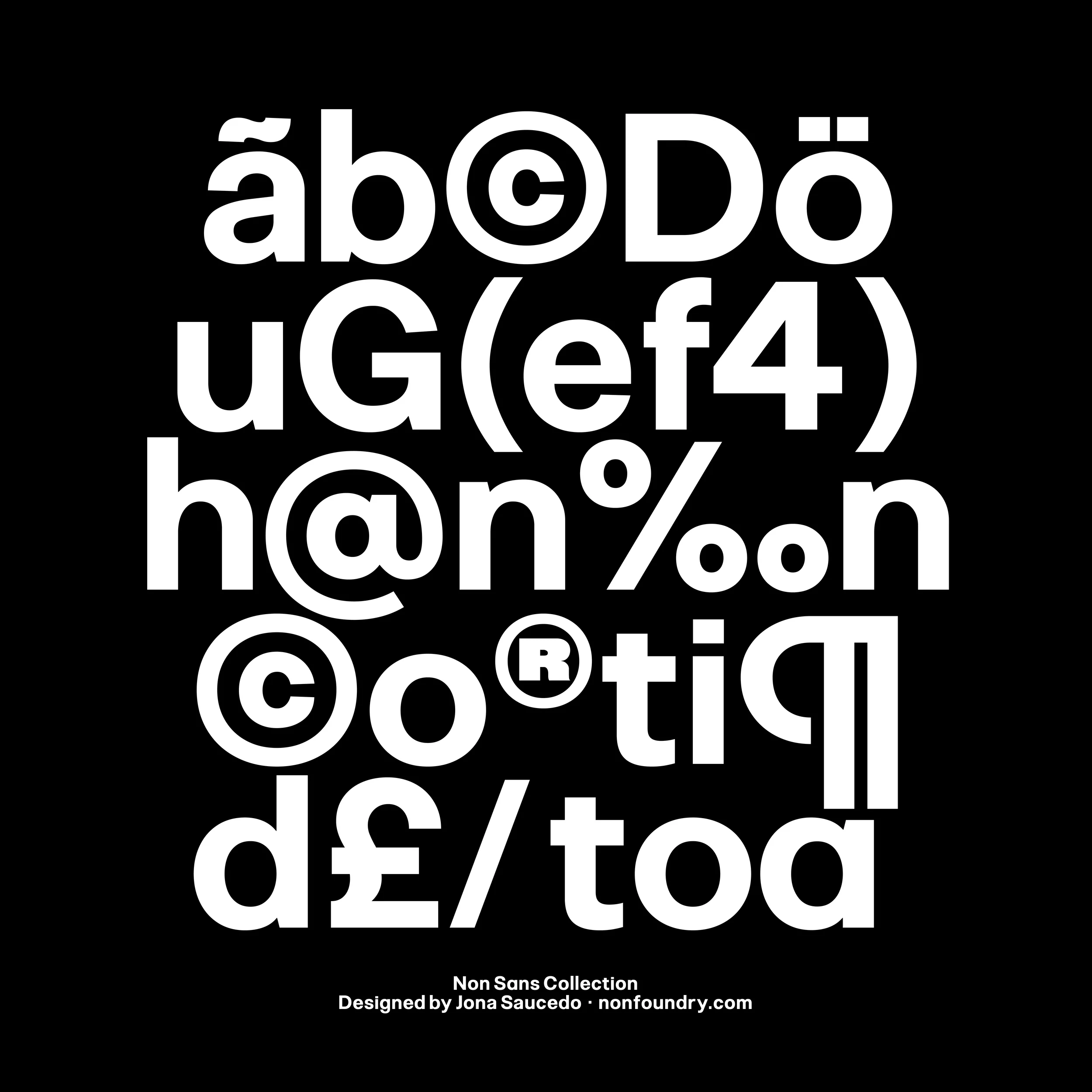
Both internal and external glyph spacing have been carefully optimized, with particular attention to detail, ensuring excellent legibility even at small sizes and on low-resolution screens. Through this balance of functionality, character, and versatility, Non Sans positions itself as a contemporary, solid, and highly adaptable typographic tool for a wide range of design contexts.
- - - - - - - - - - - - - - - - - - - - - - - - -
Need help determining what license you need? Head to our licensing page for more details, or download our free font licensing guide below to help you make the correct choice.
Original: $69.79
-65%$69.79
$24.43

Description
Non Sans is a grotesque style sans serif typeface defined by a dense, robust, and reliable visual construction. Its design creates a solid reading rhythm and a compact, well-balanced text block, making it ideal for typographic systems that demand presence, clarity, and consistency. From its earliest sketches, the influence of Swiss type design from the 1960s is evident, particularly in the functional treatment of forms and the modular structure of its characters.
The family has been carefully refined to deliver strong typographic performance across a wide range of environments and formats. Non Sans features a unified system of x-heights, width proportions, and weight consistency, resulting in a precise and coherent typeface suitable for both editorial projects and digital or interface applications.
As part of the collection, Non Sans Slant preserves the strength of the base design while introducing dynamism and contrast, allowing for emphasis and hierarchy without breaking the system’s identity. In addition, the Rotate variant expands the expressive possibilities of the family. Designed for display use such as logos, posters, and graphic assets, this version retains the core structure and details of Non Sans while adding a distinctive and experimental character.
Both internal and external glyph spacing have been carefully optimized, with particular attention to detail, ensuring excellent legibility even at small sizes and on low-resolution screens. Through this balance of functionality, character, and versatility, Non Sans positions itself as a contemporary, solid, and highly adaptable typographic tool for a wide range of design contexts.
- - - - - - - - - - - - - - - - - - - - - - - - -
Need help determining what license you need? Head to our licensing page for more details, or download our free font licensing guide below to help you make the correct choice.