Non Ophelie
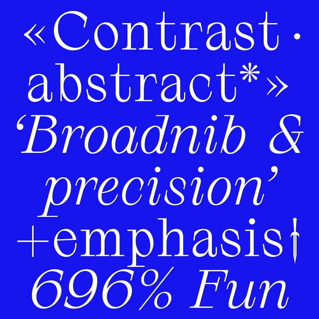
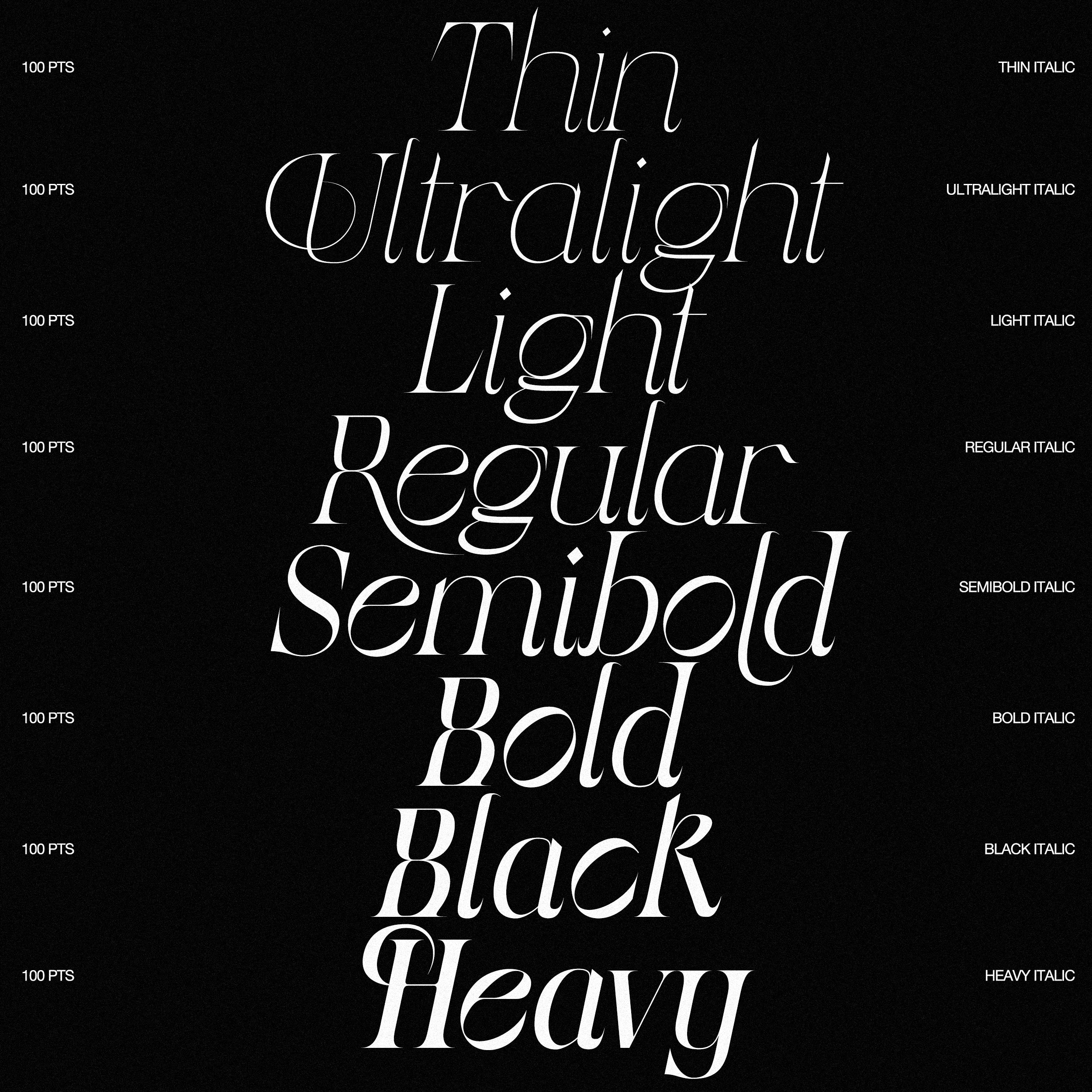
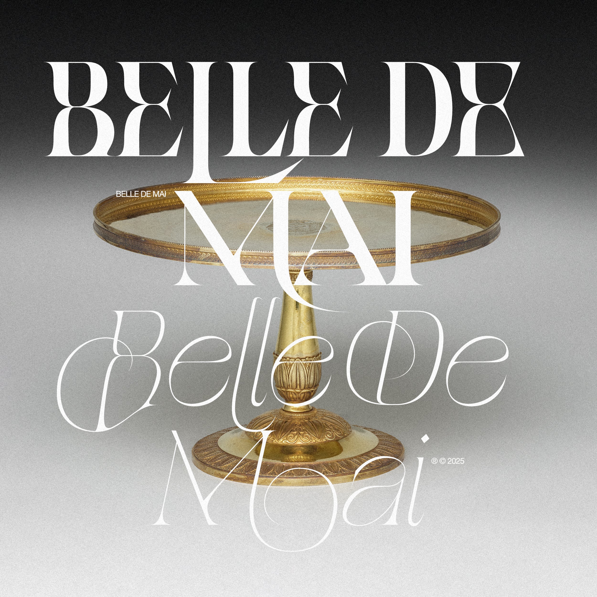
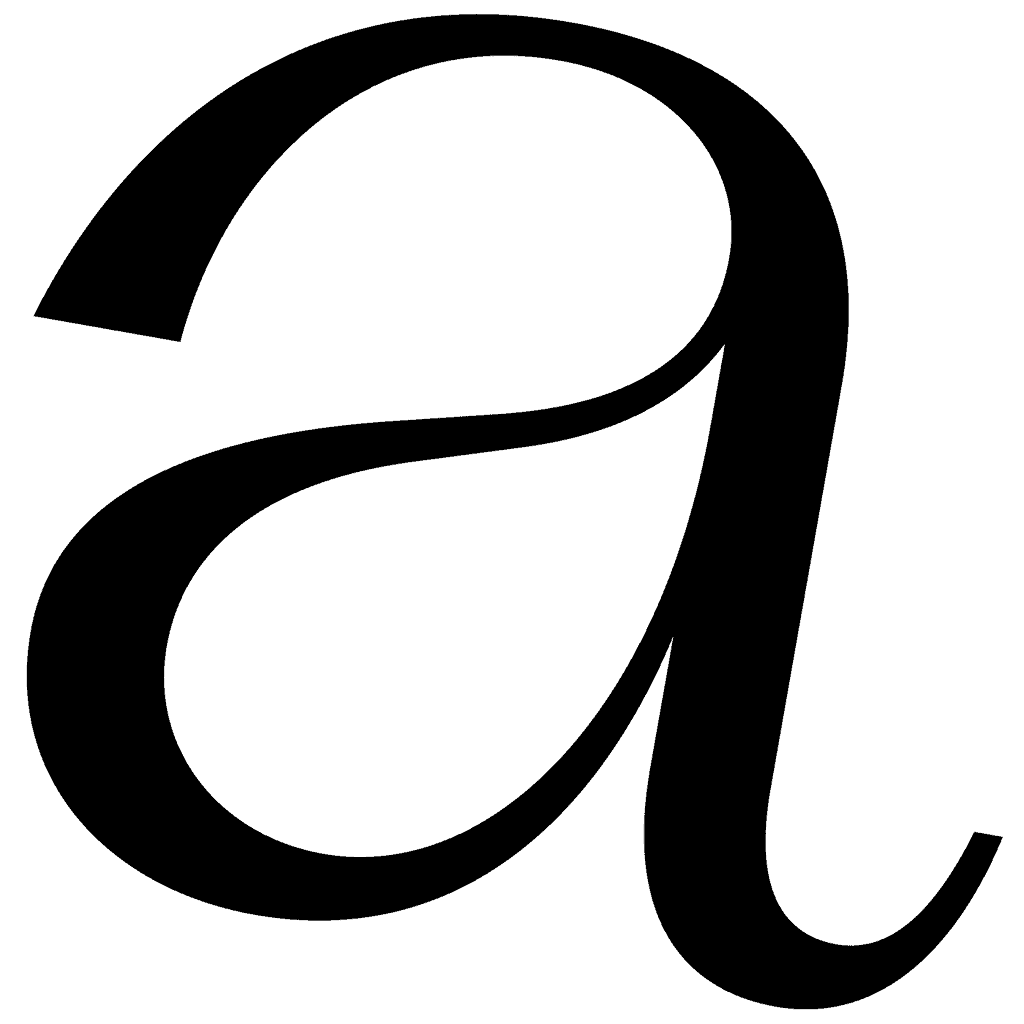
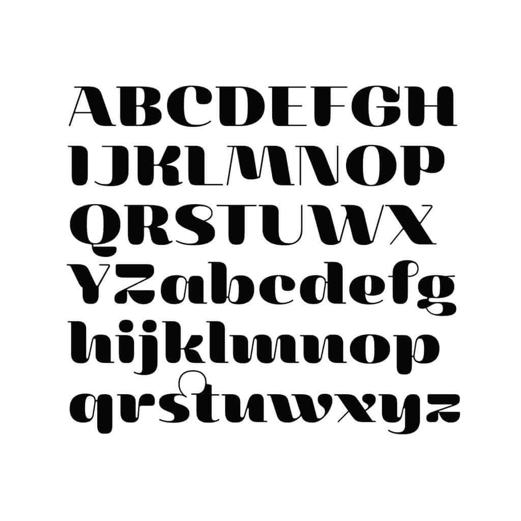
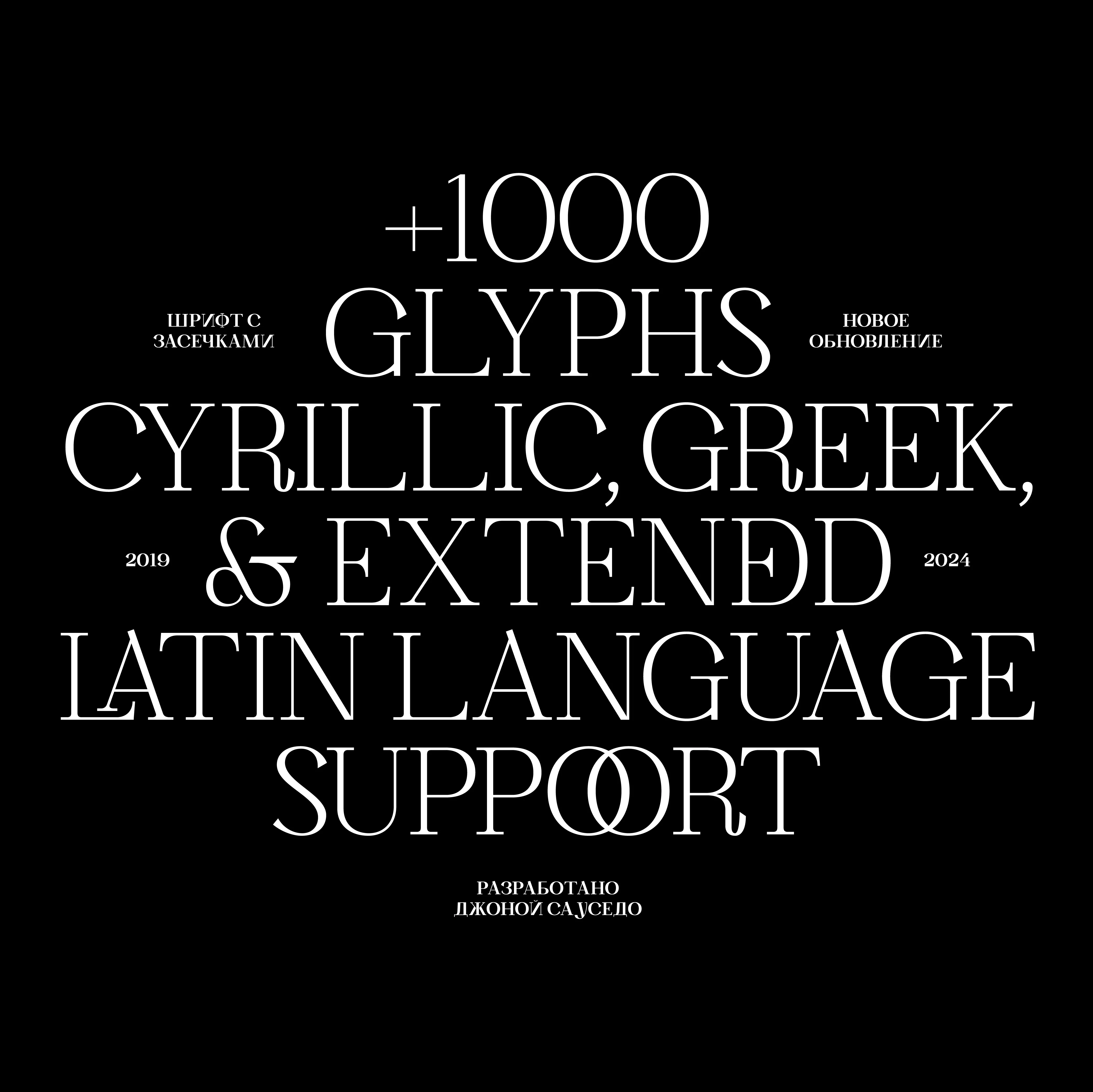
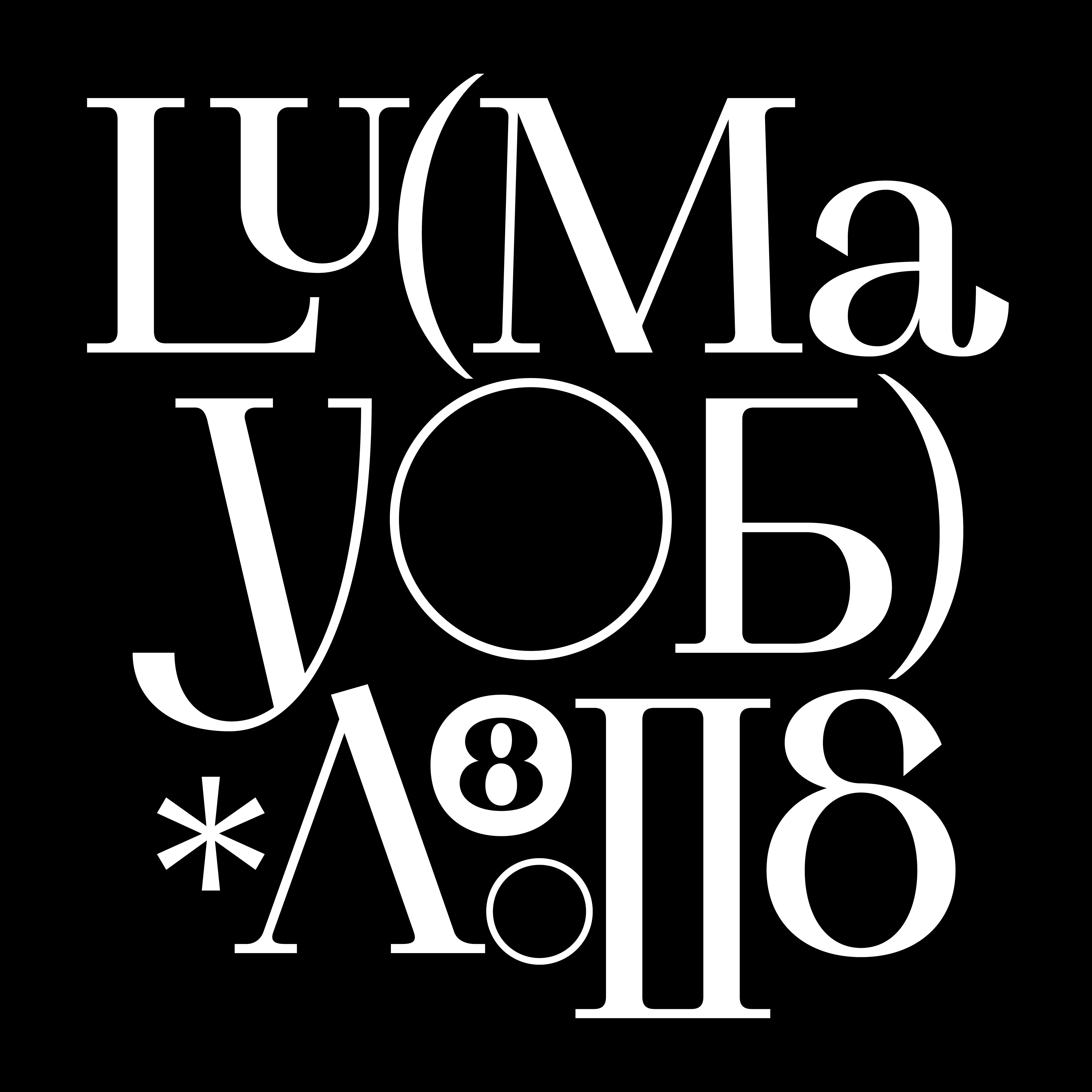
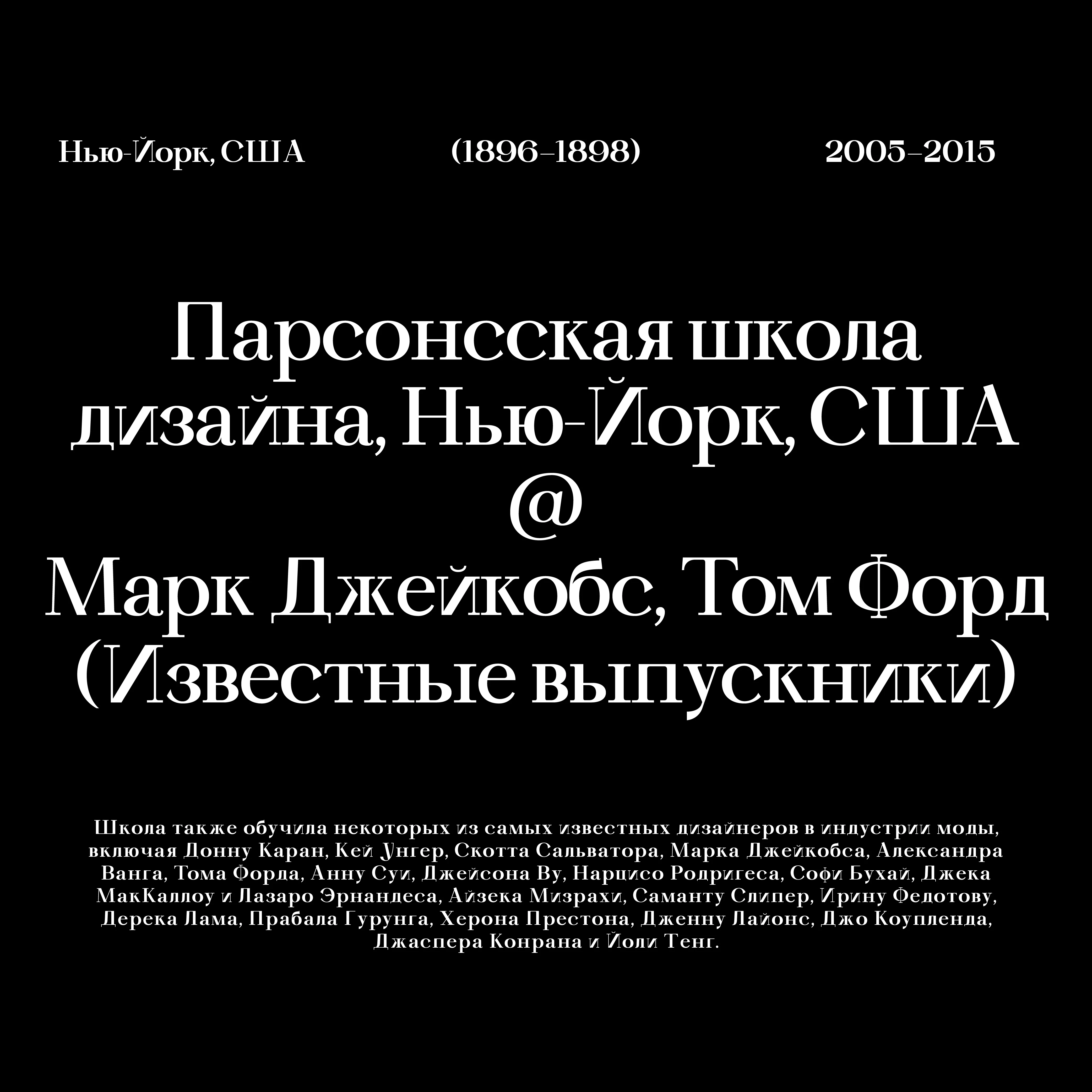
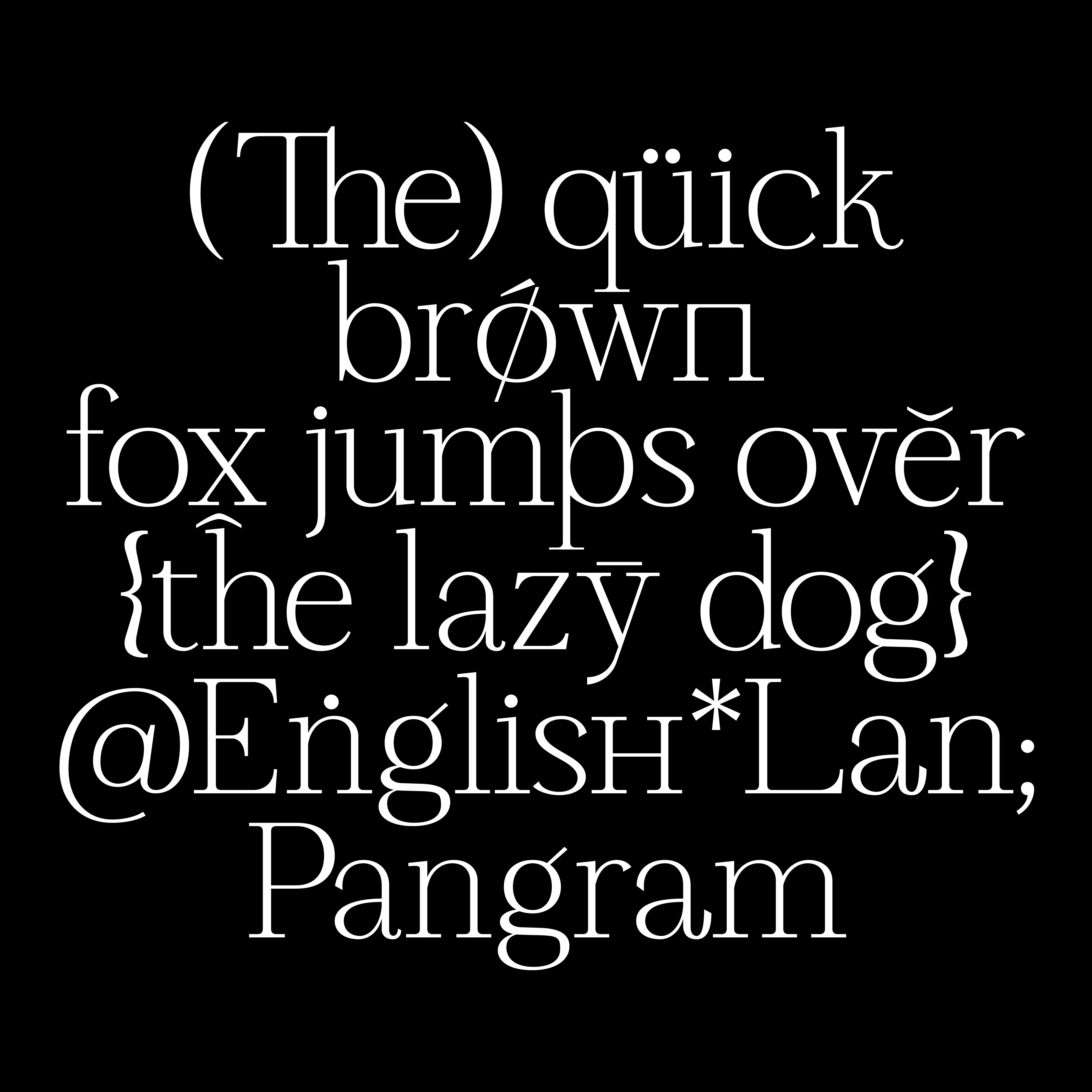
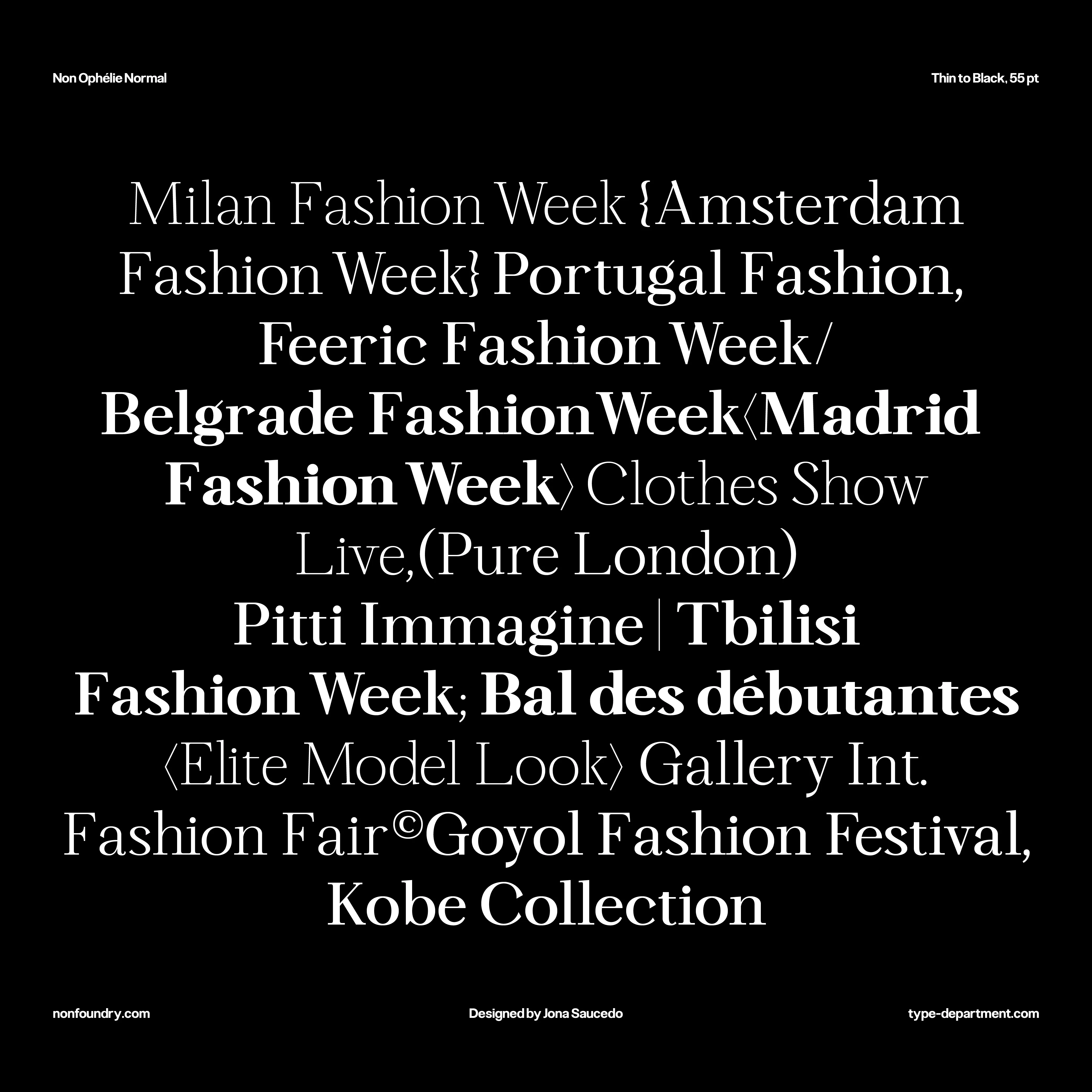
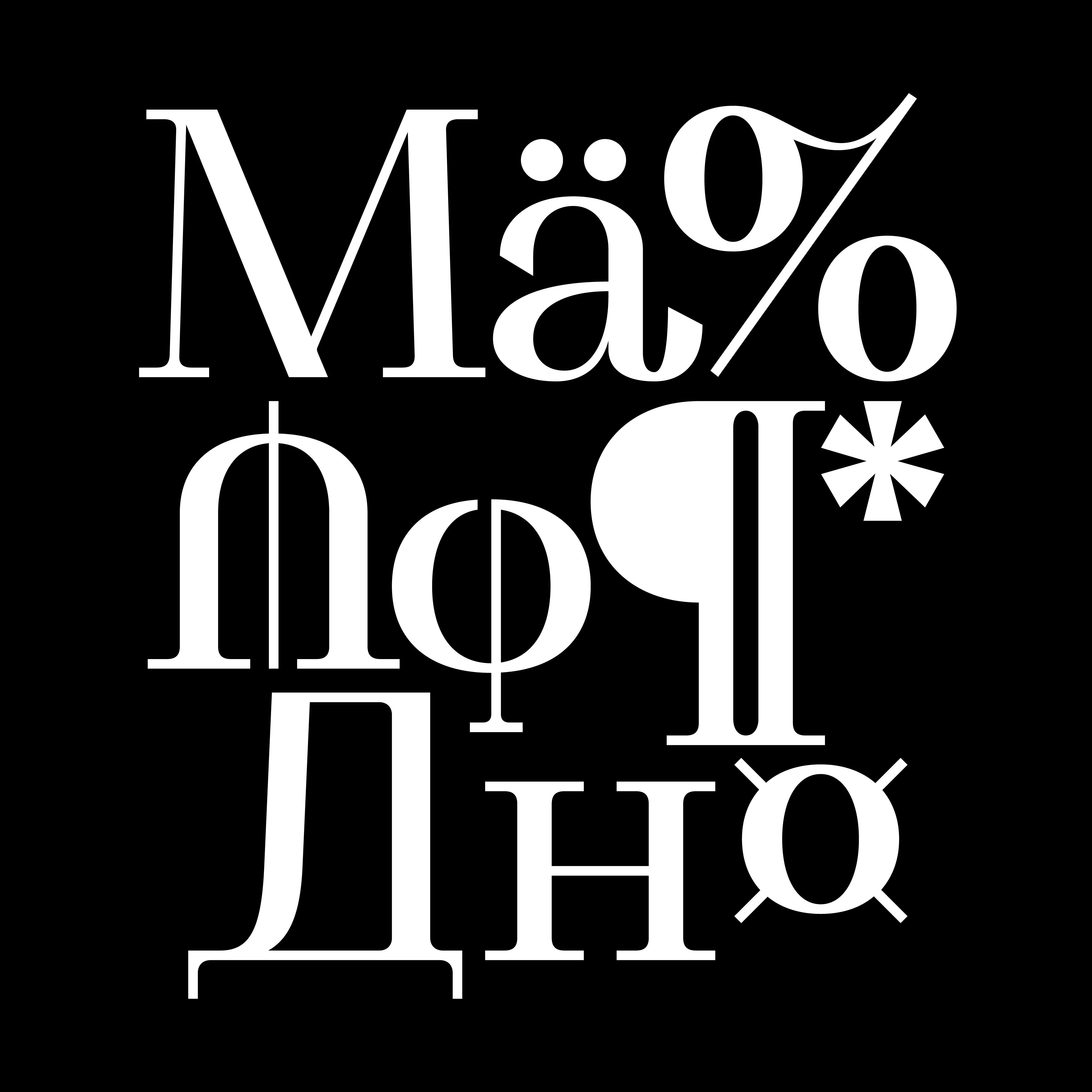
Non Ophelie Display began with the lowercase "a," an expressive letter characterised by fluid curvature and rapid movement from its beginning to its pronounced tail. These features are reflected throughout the entire alphabet (now including Cyrillic and Greek), making them the defining characteristics of the typeface.
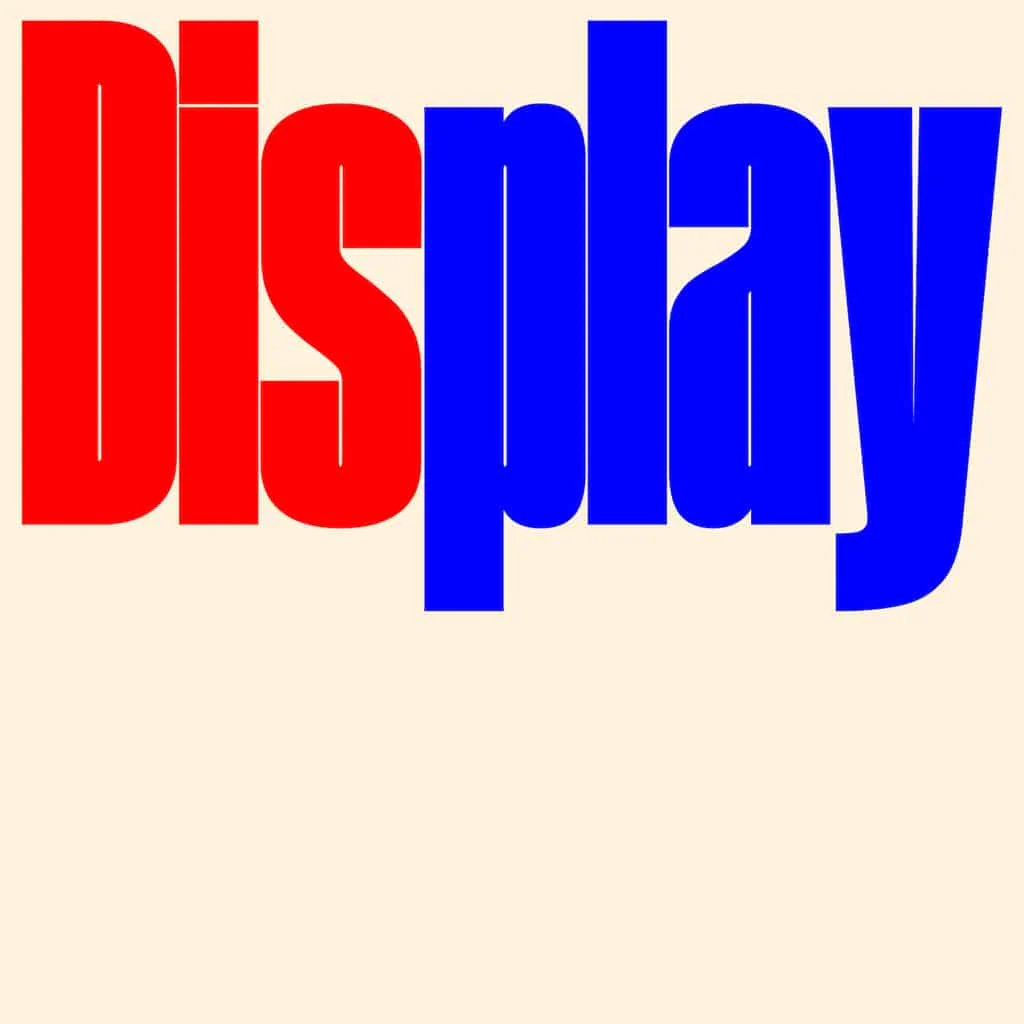
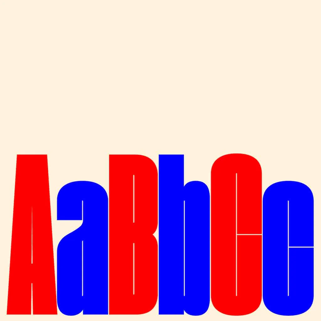
These details are also present in the uppercase glyphs, creating a consistent typographic system. Additionally, the high contrast between thin and thick sections, the terminal details, and its optimisation make Non Ophelie a typeface that performs best when used at large sizes.
- - - - - - - - - - - - - - - - - - - - - - - - -
Need help determining what license you need? Head to our licensing page for more details, or download our free font licensing guide below to help you make the correct choice.
Original: $83.21
-65%$83.21
$29.12

Description
Non Ophelie Display began with the lowercase "a," an expressive letter characterised by fluid curvature and rapid movement from its beginning to its pronounced tail. These features are reflected throughout the entire alphabet (now including Cyrillic and Greek), making them the defining characteristics of the typeface.
These details are also present in the uppercase glyphs, creating a consistent typographic system. Additionally, the high contrast between thin and thick sections, the terminal details, and its optimisation make Non Ophelie a typeface that performs best when used at large sizes.
- - - - - - - - - - - - - - - - - - - - - - - - -
Need help determining what license you need? Head to our licensing page for more details, or download our free font licensing guide below to help you make the correct choice.